This is the original scan of my Olly Murs illustration aswell as my final edit for the design. i selected a few areas of the image (hat and collar) to colour as i did with the previous image and used the same techniques to make the images look similar. This will ensure a continuous style throughout the piece.
Wednesday, 30 May 2012
Tuesday, 29 May 2012
here are a few of the edits i created as part of my development work for this project, i like the idea of a very simple colour scheme so in all of these edits i have used a limited selection of colours. i have adjusted the levels to make the drawing clearer and experimented with using a skin tone over the face as the only colour. i am not completely happy with these edits though and wouldnt feel confident using them in my work so i am going to continue development until i produce somethikng i am confident with.
I began my illustrations for this project by creating this pen drawing of Rita Ora, one of the performers at the festival. Once i had scanned the design into the computer a lot of the quality was lost so before i add the image into the final design i will need to edit them on photoshop to increase the quality.
Wednesday, 25 April 2012
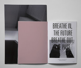
These are some examples of layouts i have collected from the internet. i liked these mainly due to the minimal use of colour. i think that by staying with a mainly monochrome scheme with simple hints of colour the page looks very attractive despite simple designs. this is something i would like to carry through and experiment with in my own work.
Wednesday, 18 April 2012
research into festival programmes
This link will lead you to an example of the research i collected into past festival programmes, i seen this design and decided i didnt want to create something as complex and busy as this one. i want to create a leaflet which is a lot more concise with a select amount of information, this will look better and not be too long to keep the reader interested.
This link will lead you to an example of the research i collected into past festival programmes, i seen this design and decided i didnt want to create something as complex and busy as this one. i want to create a leaflet which is a lot more concise with a select amount of information, this will look better and not be too long to keep the reader interested.
Tuesday, 3 April 2012
As we have been given the oppurtunity to create our own brief for this module I have decided to do a editorial based project again as I really enjoyed the typographic circle brief. As I have so much freedom with this project i wanted to make sure it was something I really enjoyed so I wouldnt lose interest during it, as we have quite a long time to produce the work. My final project is going to be a pre festival guide for v festival. Originally I planned on creating a programme for a festival but once id thought about content ect, i thought that a guide to send out with tickets before the festival would be a better idea and something that hasnt really been done previously. I plan to include things like information about artists performing at the festival, with illustrations, festival camping tips and many other things. I feel like this would be more useful to a festival goer as they will be provided with essential festival info before they're there.
Subscribe to:
Posts (Atom)


